
Project Overview
A comprehensive 3-page Power BI dashboard providing real-time visibility into cybersecurity operations, vulnerability management, and compliance tracking across 500+ enterprise systems.
Built for: Executive decision-making and security operations prioritization
Timeline: October – November 2025
Tools: Power BI Pro, DAX, Power Query, SQL
🔗 Explore Interactive Dashboard
The Challenge
Security teams at enterprise organizations struggle with:
❌ Visibility gaps – 500+ vulnerabilities scattered across multiple systems
❌ Priority confusion – Which issues need immediate attention?
❌ Compliance complexity – Tracking SOC 2, ISO 27001, NIST requirements
❌ Manual reporting – Hours spent preparing status updates for executives
The question leadership asks: “What’s critical RIGHT NOW?”
Most teams can’t answer quickly.
My Approach
I designed a 3-page dashboard that tells a complete operational story:
- Executive Summary – 30-second status scan for C-suite
- Vulnerability Management – Detailed analysis for security teams
- Compliance Tracking – Framework monitoring for audit preparation
Each page serves a specific audience with the exact insights they need.
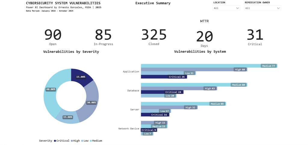
Page 1: Executive Summary

Purpose: High-level operational status for C-suite and security leadership
Key Metrics Tracked:
📊 Current Status
- 90 Open vulnerabilities
- 85 In-Progress
- 325 Closed (78% closure rate – exceeds industry average of 65%)
⏱️ Performance
- 20-day average time to remediate (meets SLA target of <25 days)
- 31 Critical vulnerabilities requiring immediate attention
🎯 Risk Profile
- Severity distribution: 40% Medium, 30% High, 15% Critical, 15% Low
- Applications have highest count: 194 total (26 Critical)
Key Insight:
The stacked bar chart reveals Applications have 26 Critical vulnerabilities – immediately directing security teams to prioritize application patching over other system types.
Interactive features: Filter by Location and Remediation Owner for drill-down analysis.
Page 2: Vulnerability Management
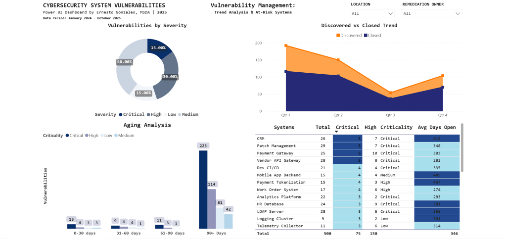
Purpose: Operational intelligence for security teams to identify trends, aging vulnerabilities, and prioritize remediation work
What This Page Reveals:
📈 Trend Analysis
- Q1 2024: 195 vulnerabilities discovered (annual audit spike)
- Q3 2025: Discovery and closure rates converging (improvement)
- Clear quarterly patterns guide resource planning
⏰ Aging Analysis
- 225 vulnerabilities aged 90+ days (backlog requiring escalation)
- Stacked by severity: Most are Medium priority, but Critical items exist
- Visual immediately shows if urgent issues are aging too long
🎯 At-Risk Systems
| System | Critical | High | Avg Days Open |
|---|---|---|---|
| CRM | 5 | 7 | 415 |
| Patch Management | 5 | 7 | 348 |
| Payment Gateway | 5 | 10 | 303 |
Key Insight:
CRM system has 5 Critical vulnerabilities with 415-day average age – the conditional formatting (dark blue highlighting) draws immediate attention to this urgent remediation priority.
Technical note: The aging chart uses a stacked column design to show severity composition within each time bucket – revealing that not all aged vulnerabilities are equal priority.
Page 3: Compliance Tracking

Purpose: Framework compliance monitoring for audit committees and risk management
Compliance Status:
📊 Overall Score: 78%
- Target: 80% (currently 2.34% below)
- Q3 2025 peak: 95%
- Q4 2025 decline: 78%
📉 What Happened in Q4?
The trend line tells the story: Compliance peaked at 95% in Q3, then dropped to 78% in Q4. This reflects a comprehensive year-end audit that identified previously undetected gaps.
Framework Breakdown:
SOC 2 Type II: 77 findings (highest count)
- 6 Critical
- 14 High
- 38 Medium
- 19 Low
ISO 27001: 74 findings
NIST SP 800-53: 24 findings
PCI DSS: 7 findings
Business Unit Performance:
- Operations: 79% (lowest – needs focused support)
- HR: 81%
- IT: 83%
- Finance: 86%
- Security: 89%
- Other: 100%
Key Insight:
The matrix visual groups findings by framework and severity, revealing that SOC 2 Type II compliance requires immediate attention with 77 total findings concentrated in monitoring and malicious software controls.
Technical Highlights
Data Architecture
Data Model: Star schema design
- Fact Table: Vulnerabilities (500 rows)
- Dimension Tables: Systems (30 rows), Compliance (200 rows)
- Date Table: Custom DAX-generated calendar (2024-2025)
Relationships: One-to-many from Systems → Vulnerabilities
Advanced Power BI Features
✅ Custom DAX Measures
MTTR =
CALCULATE(
    AVERAGE(Vulnerabilities[Days_To_Remediate]),
    Vulnerabilities[Status] = "Closed"
)

Critical Count =
CALCULATE(
    COUNTROWS(Vulnerabilities),
    Vulnerabilities[Severity] = "Critical"
)
✅ Conditional Formatting
Gradient scales automatically highlight high-priority items using color intensity
✅ Cross-Page Filtering
Slicers enable multi-dimensional analysis across all visualizations
✅ Matrix Visuals
Hierarchical grouping by framework reveals compliance patterns
✅ Time Intelligence
Trend analysis with quarter-over-quarter comparisons
Design Principles Applied
Color Strategy:
- Blue gradient palette for professional, corporate appearance
- Darker shades indicate higher priority/urgency
- Minimal accent colors (orange for targets only)
- Consistent across all pages
Information Hierarchy:
- Page 1: Summary metrics (executive 30-second scan)
- Page 2: Operational details (daily security team use)
- Page 3: Compliance monitoring (audit preparation)
Real-World Applications
This dashboard structure is used in:
🏢 Security Operations Centers (SOC)
Real-time monitoring and incident prioritization
🔒 Risk Management
Executive reporting on security posture and compliance status
📋 Audit Preparation
Framework compliance tracking for SOC 2, ISO 27001, NIST assessments
👔 Board Presentations
C-suite visibility into cybersecurity operations
Industries:
Utilities • Financial Services • Healthcare • Government • Technology
Based On:
This structure mirrors production dashboards I worked with in the Energy sector, where I tracked $50M+ IT operations and cybersecurity compliance for utility infrastructure.
What This Project Demonstrates
Technical Skills
✅ Power BI Pro (advanced visualizations, DAX, Power Query)
✅ Data modeling (star schema, relationships, calculated columns)
✅ Business intelligence (KPIs, trend analysis, conditional formatting)
✅ SQL (data extraction and transformation)
Business Acumen
✅ Cybersecurity domain knowledge
✅ Risk-based prioritization thinking
✅ Executive communication (distilling technical data for leadership)
✅ Compliance framework understanding (SOC 2, ISO 27001, NIST)
Soft Skills
✅ Translating business requirements into technical solutions
✅ Information design and visual communication
✅ Stakeholder-focused reporting
Portfolio Quality
This isn’t a tutorial project. It’s production-ready work that could be deployed in enterprise environments today.
Explore the Project
🔗 Interactive Dashboard
Launch Dashboard
Try the filters, explore the data, see how interactive visualizations guide decision-making.
💻 GitHub Repository
View Code & Documentation
Complete technical documentation, DAX measures, data model structure, and design decisions.
📺 Video Walkthrough
Coming This Week
5-minute guided tour explaining the business problem, technical approach, and key insights.
Let’s Connect
Interested in discussing data analytics, Power BI best practices, or cybersecurity operations?
📧 Email: hello@ernestogonzales.com
💼 LinkedIn: linkedin.com/in/eg-data
💻 GitHub: github.com/ernestog27
🌐 More Projects: Browse Portfolio
Ernesto Gonzales, MSDA
Data Analyst | San Diego, CA
Master’s Degree in Data Analytics, Western Governors University
Specializing in Power BI, SQL, Python, and transforming complex operations into executive insights.